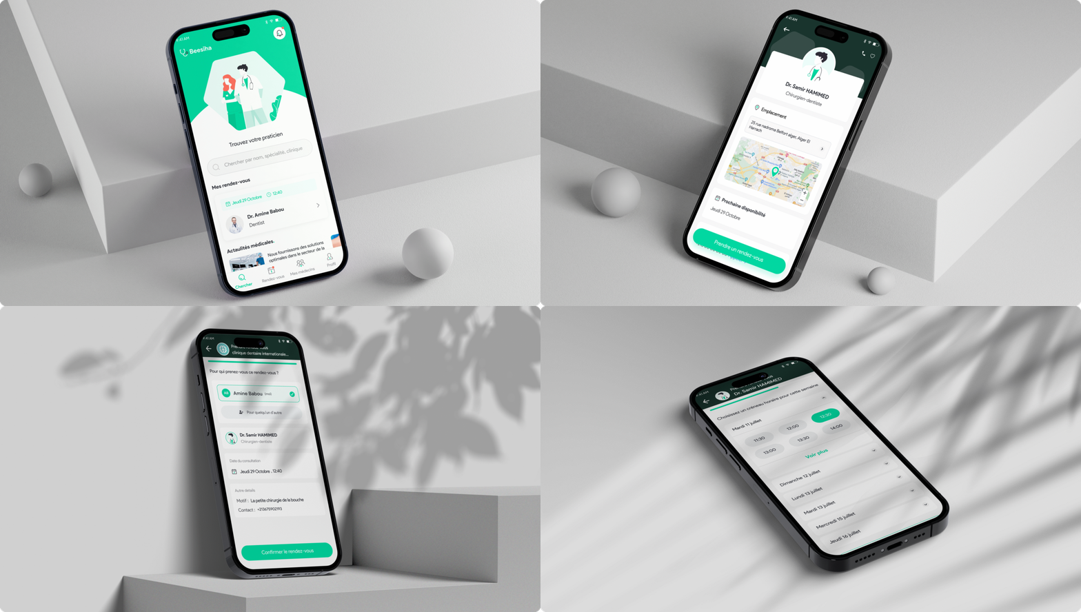
Better booking with clear doctor vs. clinic profiles.
I led the design process in a 2-months project to redesign the whole app, The goal was to enhance the user experience of booking an online appointment with a doctor.
Roles
UX Designer (Research, Visual Design, Interaction Design, Usability Testing).
Duration
July 2023 - August 2023
Methods
User research
User testing
User interviews
Competitive analysis
Prototyping
Tools
Figma
Adobe Illustrator
Whimsical
Google forms
Paper
What is Beesiha
Founded in 2020, Beesiha is one of the fastest-growing e-health services in Algeria, helping practitioners be more efficient, better collaborate with peers, and improve their patients' experience, founded by a group of young Algerian engineers and entrepreneurs, accompanied by health professionals. Completely free, the appointment service is available 24 hours a day, 7 days a week with the mobile application or the website.
The Challenge
I was part of a crucial team tasked with closing the gap between patient and doctors, a platform for doctor online booking appointments. As a UI/UX Designer, I led the design process for redesigning the experience of online booking, Our challenge was to enhance the process and reducing frustration during the booking appointment process.
Old design
In the old design you can see that the booking process and doctor information are in the same page and that were confusing for users.
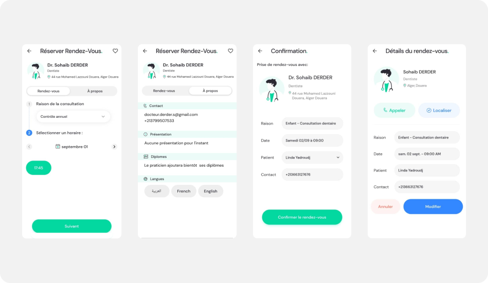
Beesiha booking appointment - Old design
Research
Research enables me to dig deep into my understanding of users - not only their immediate frustrations, but also their hopes, fears, abilities, limitations, reasoning, and goals. It lays essential foundations for creating solutions in later stages.
The design didn’t change for 2 years and and even the flows and it was the time to do a global change whether in the design or the user experience, so as a first step i conducted user testing sessions to identify problems and pain points that users may have.
User testing
- All the participants click directly on the “search” button because it is well highlighted and attracts the user's eyes plus the search input is a bit invisible especially for persons who lack vision like me and my sister, i suggest to use only a search input .
- Clicking on the search button in the search page leads me to the “Wilaya” page whereas clicking on the “search input” leads me to the specialties page.
- When clicking on the “Signing” button it takes me to a page where i have to enter my phone number then it takes me to the signup page, it should take me to a page where i enter an OTP code and the search page, even when i try to login with an unregistered phone number it takes me to the signup page.
- most of the participants got confused when the slots of the doctor don’t appear, they clicked on “selectionner un horaire” or on the icon.
- When I want to create a new account with a used phone number the app enters me in the flow of creating a new account but after finishing the process I found myself in my account.
- All participants click on the text “reason de consultation”
- All users want to see the doctor information first before deciding to take an appointment or not.
- All users want the taking appointment process separated
- The lack of opacity is a big problem in the app especially for people with lack of vision, at this point i can say that the app isn't accessible for all people.
- Most of users find it hard to read in the app because the text is so small.
- Most of users forgot about creating a new account.
User Interviews
Questions asked:
General Usage Questions
- What motivated you to use this app in the first place ?
- Can you describe the last time you used Beesiha ?
Booking Process
- Were you able to find the doctor you were looking for easily ?
- What information or features were most helpful during the booking process ?
- What challenges or difficulties have you faced in the process ?
Search and Discovery
- How do you usually search for doctors on the app ? (Specialty, location, etc.) ?
- What factors influence your choice of doctors ?
- Were you satisfied with the search results? Why or why not ?
- What improvements would you suggest to make finding a doctor easier ?
Doctor Profiles
- When selecting a doctor, what information do you find most important on their profile ?
- Do you find the doctor's profile information to be accurate and helpful ?
User Experience and Interface
- What do you like most about the app's design and user interface ?
- Is there anything about the app's design that you find confusing or frustrating ?
Some User’s Response i can share
- I want the flow of booking an appointment more organized and fluid in a way i don’t fill that i do hard work.
- Finding doctors with availability has been a struggle. Sometimes I have to call multiple clinics to check. It would be great if the app could show real-time availability.
- Participant: I wish the app could provide detailed doctor profiles, including their specialization, experience, and patient reviews. It helps me make an informed decision.
Competitive analysis
To identify potential areas for improvement, I conducted a competitive analysis of Online Doctor Booking Apps like doctolib, zocdoc. By interacting with these apps, taking screenshots and noting common features, I was able to observe how competitors solve similar problems. My goal was to gather insights on features, value propositions, user flow, layout, and tone and language.
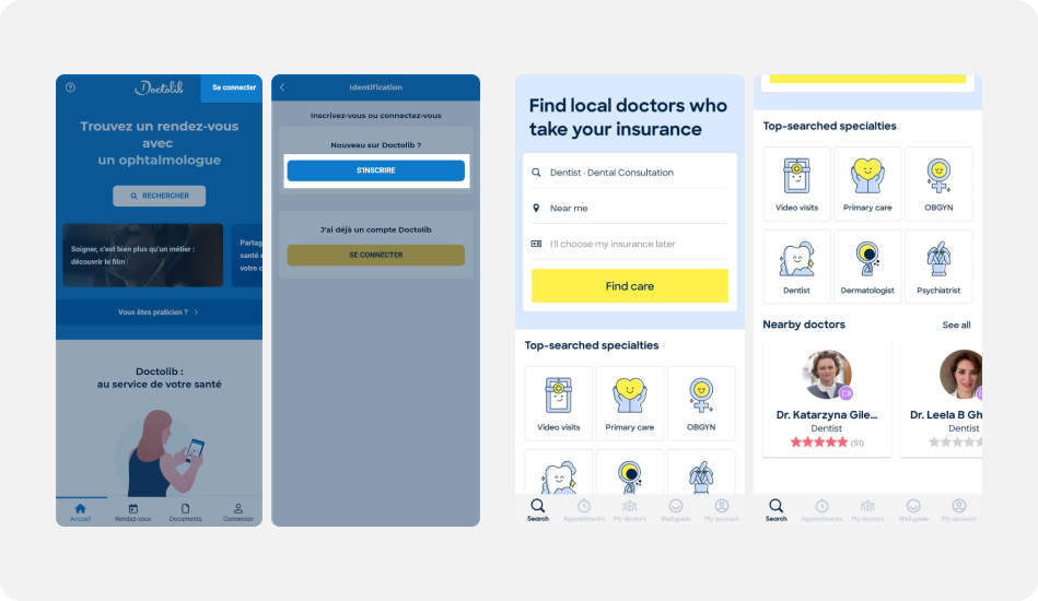
Competitive analysis - doctolib & zocdoc
Survey
As a UX designer, I conducted a user survey to gather valuable insights and opinions from our users. The survey was designed to assess their overall experience with our product and identify areas for improvement. These results serve as a vital tool in our ongoing efforts to create a more user-centric and enjoyable product experience.
NB : I am not allowed to show the results.
Tool : google forms
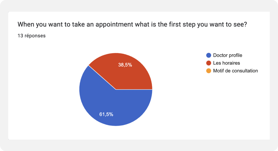
Beesiha - Survey
User flow
I created a visual user flow to align with the team on feature functionality before designing the interface. This also contributes to a smoother navigation experience, helping users accomplish tasks efficiently.
- The user can take the appointment from a doctor or from a clinic profile.
- The user is logged
- The user has an account but not logged
- The user doesn’t have an account
But in this case study i will show the user flow of the taking appointment from doctor profile where the user is connected.
Tool : Whimsical
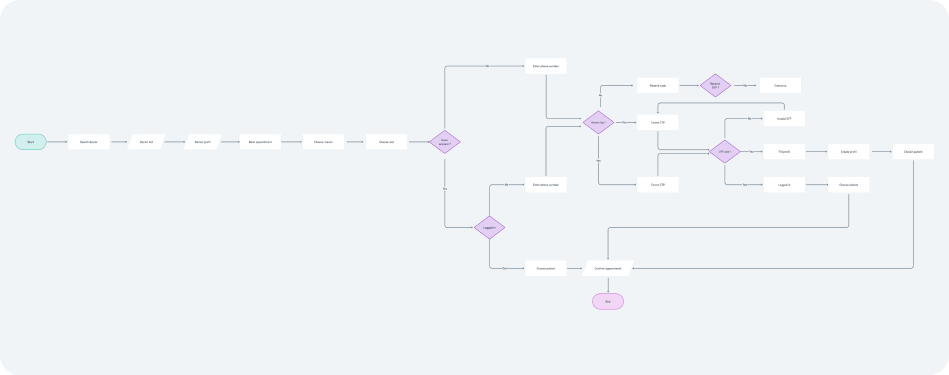
Beesiha - User flow Take appointment from doctor profile
Design
Profiles of Doctors and Clinics
Profiles of Doctors and Clinics on our online appointment booking platform are meticulously curated to provide users with comprehensive insights into the healthcare providers available. Each profile highlights their qualifications, areas of specialization, languages spoken, location and contact information plus gallery and doctors for clinics.
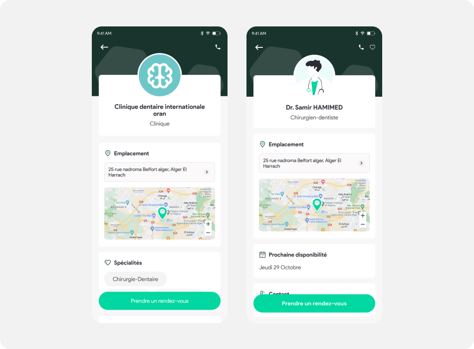
Beesiha - Doctors & clinic profiles
Clinic profile
Our clinics feature multiple doctors, each specializing in various medical fields. This diversity allows patients to access a range of healthcare expertise all within one clinic location. Patients can easily schedule appointments with specific doctors based on their needs, ensuring they receive specialized care when required. This streamlined access to a variety of medical professionals enhances the quality and efficiency of healthcare services on our platform.
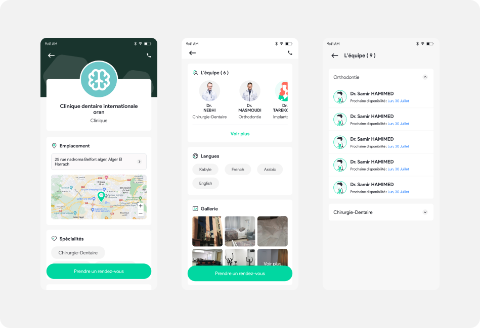
Beesiha - Clinic profile
Appointment Booking
In the booking appointment flow the user has to choose the time slot, reason of consultation, doctor specialty ( in clinic case ) and the patient.
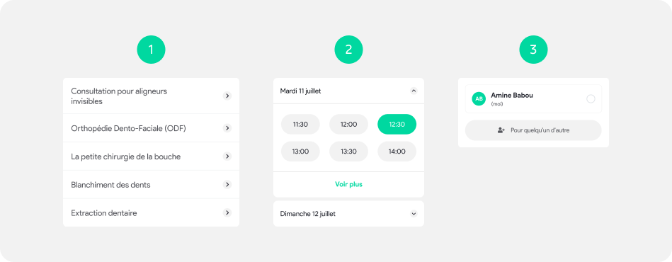
Beesiha - steps user (logged) can take when booking appointment
Receive notifications
Users can receive notifications about their appointment as reminders.
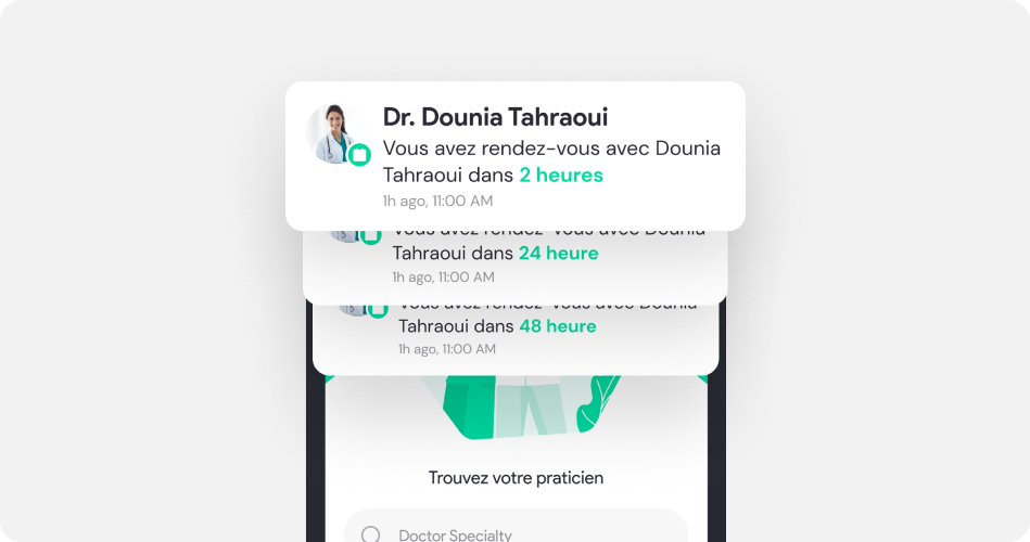
Beesiha - receive notifications from the doctor
User not logged or doesn’t have an account
When the user wants to book an appointment but he doesn’t have an account or not logged yet we walk him through the process till the tim slot before the last confirmation step we redirect him into the signup/login glow.
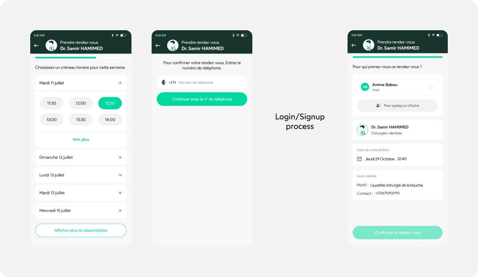
Beesiha - receive notifications from the doctor
Prototype
After all the research and design, let's bring it to life!
I used Figma to create an interactive Hi-fi prototype, which represents the product closest to the final design in terms of UI components, colors, layouts, and functionalities. Hi-fi prototype allows me to examine usability issues in detail and fix them at an earlier stage.
Try the prototype here - Take appointment via doctor profile (profile logged in)
Beesiha - Take appointment via doctor profile
Live prototype
This is a live prototype of the flow - Book an appointment via doctor profile - This live model brings my concept to life, showcasing how it functions and interacts with users. It's a concrete demonstration of my design's practicality and effectiveness, providing clear evidence of its real-world potential.
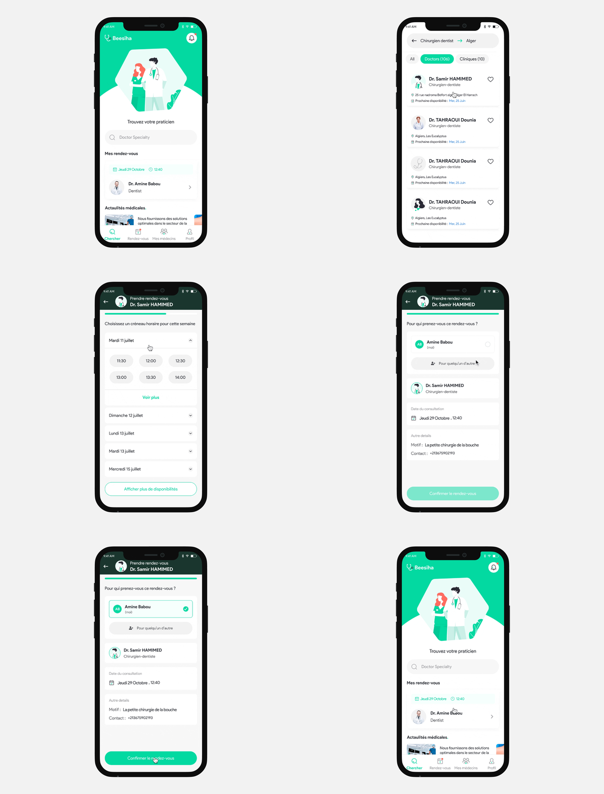
Beesiha - Take appointment via doctor profile
Results
Looking ahead, we also continued to think about ways to improve the user experience and adding new features to the app.
Reflection & learnings
The biggest lesson learned was how it is important to do user testing, talking to your users. It uncovers problematic and opportunistic points early on, providing a clear vision for effective collaboration among all stakeholders throughout the process.
While working on this project I learned to really trust the research and discovery process as I started working on it with a very different assumption and initial idea on how to solve the problem.
