Fake it till you make it.
Who is Linda 🌸

I’m Linda, a product designer with 4 years of experience and a master’s degree in computer science. I love creating things that make life easier for people 🌸
I find inspiration in drawing, the sea, and nature. Drawing helps me slow down and notice details, while the sea reminds me to stay calm and open-minded. Spending time in nature clears my thoughts and often gives me new ideas for my designs 🌸
Experience 🚀
+4 Years of Experience
UX/UI Designer
November 2023 - Present
UI/UX Designer
May 2023 - November 2023
UI/UX Designer & Integrator
Juin 2021 - Febraury 2023
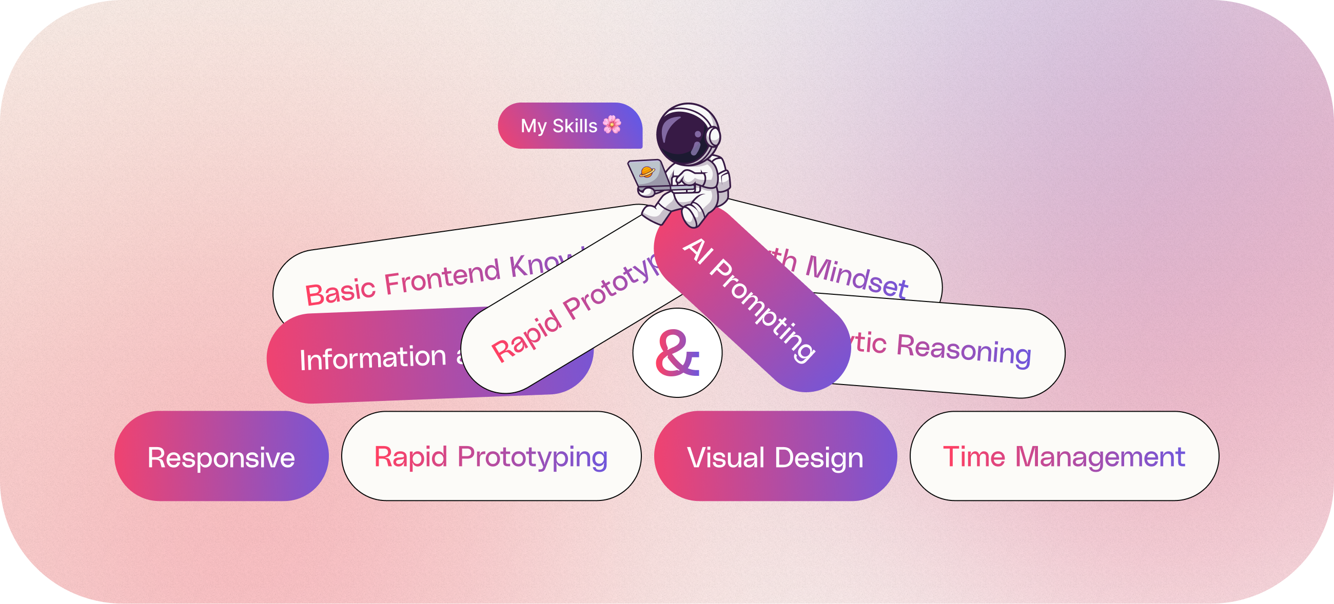
My stacks 🌻
Commitment to staying updated with the latest design trends and techniques.


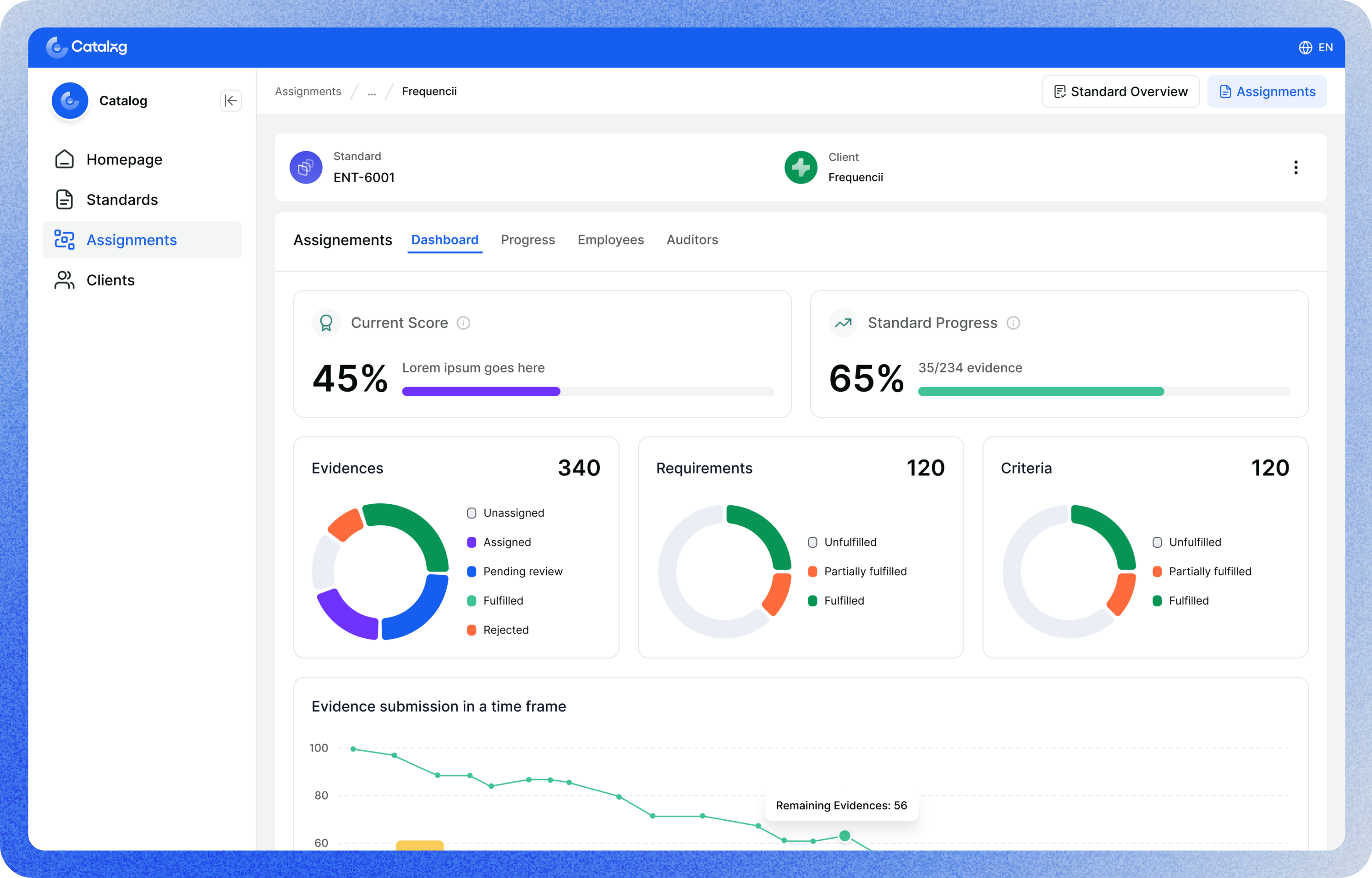
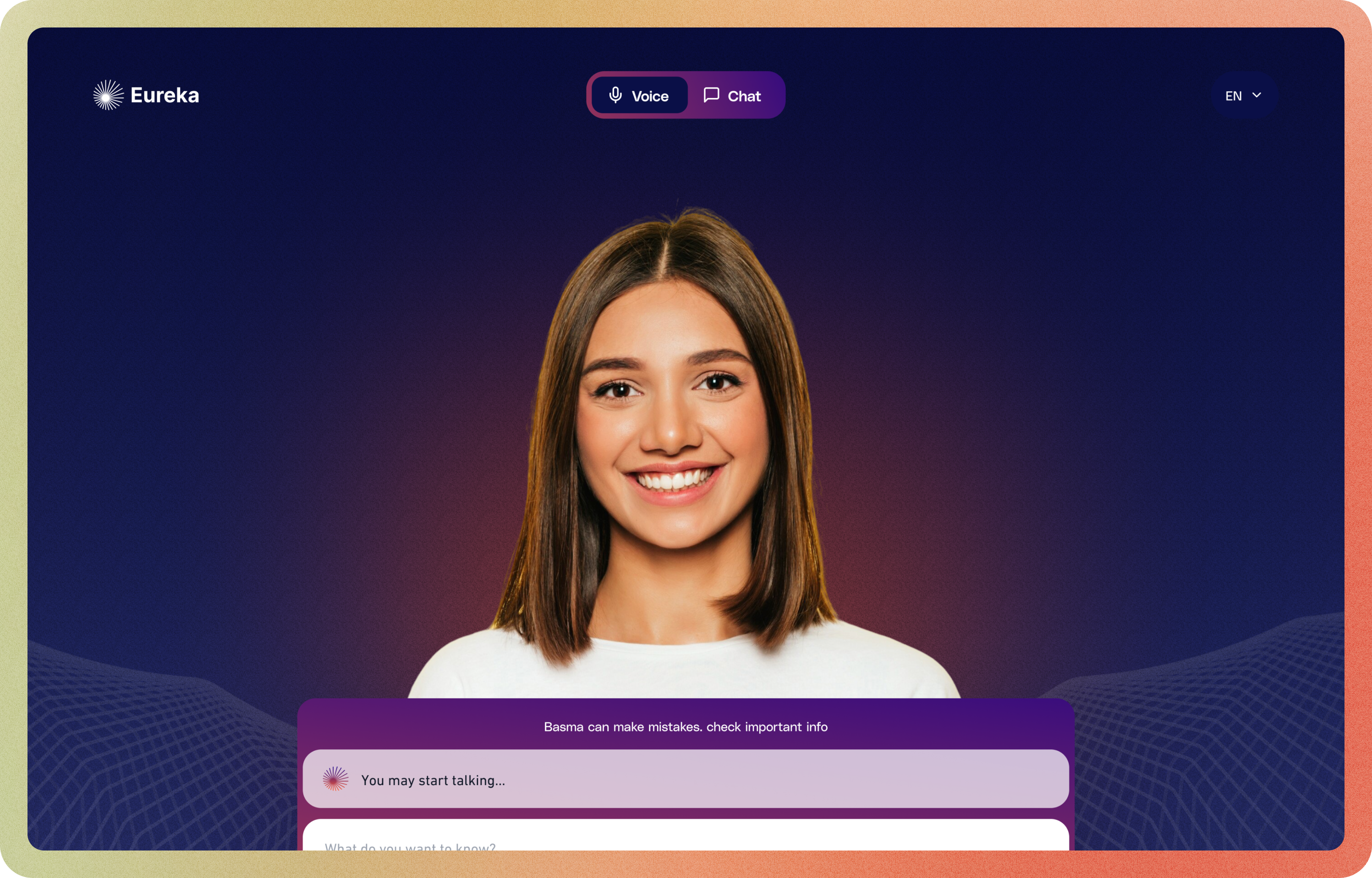
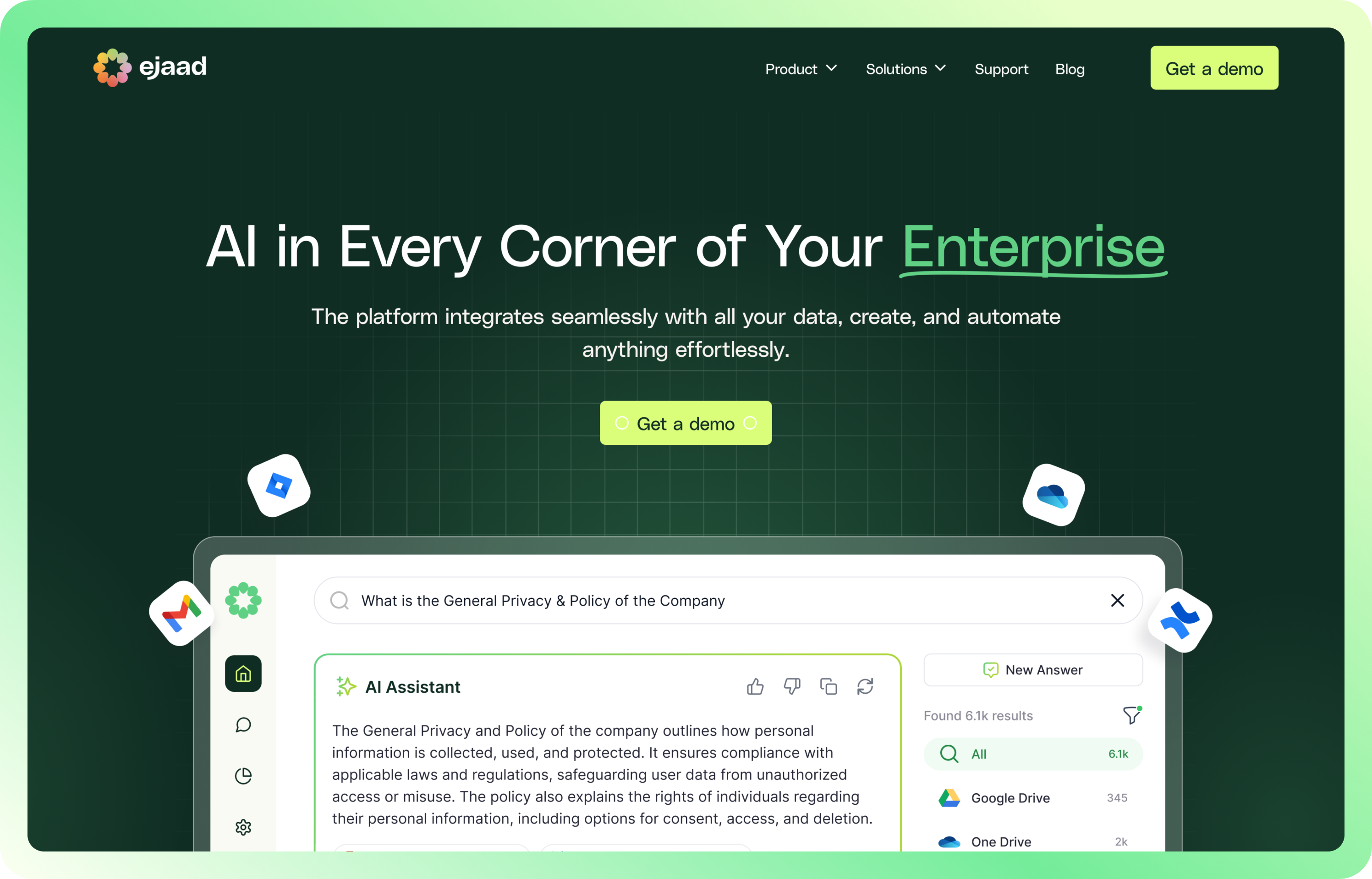
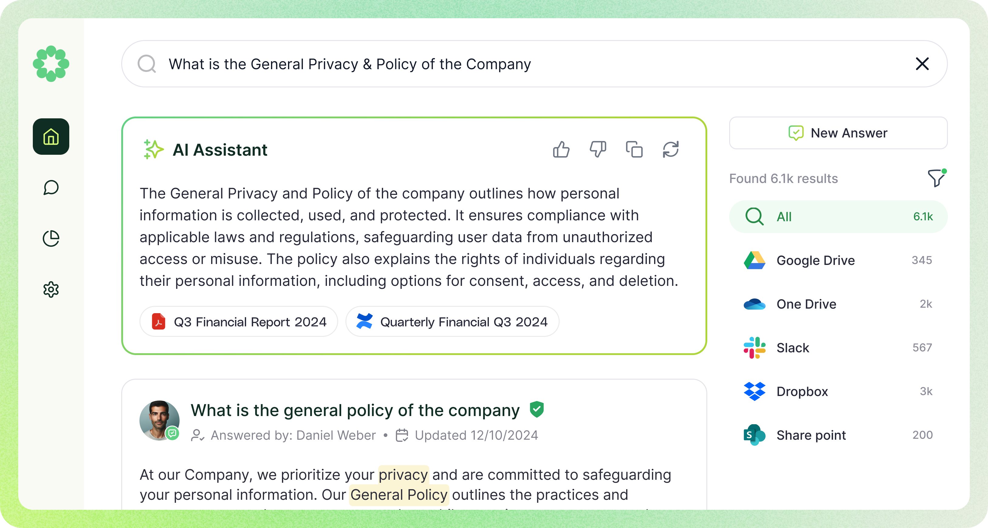
My Projects ✨